Web Components Eliminate JavaScript Framework Lock-in
We’ve seen a lot of great posts about web components lately.
Many have focused on the burgeoning HTML web components  HTML web components Don’t replace. Augment.
  adactio.com/journal/20618 pattern, which eschews shadow DOM in favor of progressively enhancing existing markup.
There’s also been discussion — including this post by yours truly
adactio.com/journal/20618 pattern, which eschews shadow DOM in favor of progressively enhancing existing markup.
There’s also been discussion — including this post by yours truly  Web Components Will Outlive Your JavaScript Framework | jakelazaroff.com If we're building things that we want to work in five or ten or even 20 years, we need to avoid dependencies and use the web with no layers in between.
 jakelazaroff.com/words/web-components-will-outlive-your-javascript-framework/ — about fully replacing JavaScript frameworks with web components.
Those aren’t the only options, though. You can also use web components in tandem with JavaScript frameworks. To that end, I want to talk about a key benefit that I haven’t seen mentioned as much: web components can dramatically loosen the coupling of JavaScript frameworks.
To prove it, we’re going to do something kinda crazy: build an app where every single component is written with a different framework.
It probably goes without saying that you should not build a real app like this! But there are valid reasons for mixing frameworks. Maybe you’re gradually migrating from React to Vue. Maybe your app is built with Solid, but you want to use a third-party library that only exists as an Angular component. Maybe you want to use Svelte for a few “islands of interactivity” in an otherwise static website.
Here’s what we’re going to create: a simple little todo app based loosely on TodoMVC 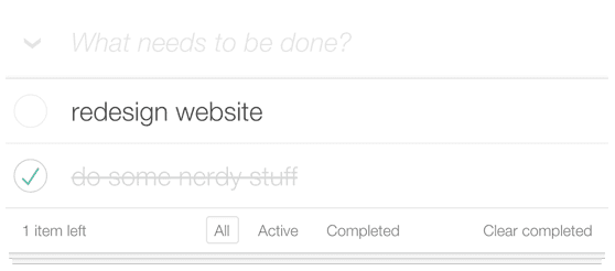 TodoMVC Helping you select an MV* framework - Todo apps for Backbone.js, Ember.js, AngularJS, Spine and many more
 todomvc.com .
As we build it, we’ll see how web components can encapsulate JavaScript frameworks, allowing us to use them without imposing broader constraints on the rest of the application.
What’s a Web Component?
In case you’re not familiar with web components, here’s a brief primer on how they work.
First, we declare a subclass of HTMLElement in JavaScript. Let’s call it MyComponent:
class MyComponent extends HTMLElement {
  constructor() {
    super();
    this.shadow = this.attachShadow({ mode: "open" });
  }

  connectedCallback() {
    this.shadow.innerHTML = `
      <p>Hello from a web component!</p>
      <style>
        p {
          color: pink;
          font-weight: bold;
          padding: 1rem;
          border: 4px solid pink;
        }
      </style>

    `;
  }
}
That call to attachShadow in the constructor makes our component use the shadow DOM  Using shadow DOM - Web APIs | MDN An important aspect of custom elements is encapsulation, because a custom element, by definition, is a piece of reusable functionality: it might be dropped into any web page and be expected to work. So it's important that code running in the page should not be able to accidentally break a custom element by modifying its internal implementation. Shadow DOM enables you to attach a DOM tree to an element, and have the internals of this tree hidden from JavaScript and CSS running in the page.
  developer.mozilla.org/en-US/docs/Web/Web_Components/Using_shadow_DOM , which encapsulates the markup and styles inside our component from the rest of the page.
connectedCallback is called when the web component is actually connected to the DOM tree, rendering the HTML contents into the component’s “shadow root”.
This foreshadows how we’ll make our frameworks work with web components.1 We normally “attach” frameworks to a DOM element, and let the framework take over all descendants of that element. With web components, we can attach the framework to the shadow root, which ensures that it can only access the component’s “shadow tree”.
Next, we define a custom element name for our MyComponent class:
customElements.define("my-component", MyComponent);
Whenever a tag with that custom element name appears on the page, the corresponding DOM node is actually an instance of MyComponent!
<my-component></my-component>
<script>
  const myComponent = document.querySelector("my-component");
  console.log(myComponent instanceof MyComponent); // true
</script>
Check it out:
There’s more to web components, but that’s enough to get you through the rest of the article.
Scaffolding Layout
The entrypoint of our app will be a React component.2 Here’s our humble start:
// TodoApp.jsx
export default function TodoApp() {
  return <></>;
}
We could start adding elements here to block out the basic DOM structure, but I want to write another component for that to show how we can nest web components in the same way we nest framework components.
Most frameworks support composition via nesting like normal HTML elements. From the outside, it usually looks something like this:
<Card>
  <Avatar />
</Card>
On the inside, there are a few ways that frameworks handle this.
For example, React and Solid give you access to those children as a special children prop:
function Card(props) {
  return <div class="card">{props.children}</div>;
}
With web components that use shadow DOM, we can do the same thing using the <slot> element <slot>: The Web Component Slot element - HTML: HyperText Markup Language | MDN The <slot> HTML element—part of the Web Components technology suite—is a placeholder inside a web component that you can fill with your own markup, which lets you create separate DOM trees and present them together. developer.mozilla.org/en-US/docs/Web/HTML/Element/slot . When the browser encounters a <slot>, it replaces it with the children of the web component.
<slot> is actually more powerful than React or Solid’s children.
If we give each slot a name attribute, a web component can have multiple <slot>s, and we can determine where each nested element goes by giving it a slot attribute matching the <slot>’s name.
Let’s see what this looks like in practice.
We’ll write our layout component using Solid  SolidJS Solid is a purely reactive library. It was designed from the ground up with a reactive core. It's influenced by reactive principles developed by previous libraries.
  www.solidjs.com :
// TodoLayout.jsx
import { render } from "solid-js/web";

function TodoLayout() {
  return (
    <div class="wrapper">
      <header class="header">
        <slot name="title" />
        <slot name="filters" />
      </header>
      <div>
        <slot name="todos" />
      </div>
      <footer>
        <slot name="input" />
      </footer>
    </div>
  );
}

customElements.define(
  "todo-layout",
  class extends HTMLElement {
    constructor() {
      super();
      this.shadow = this.attachShadow({ mode: "open" });
    }

    connectedCallback() {
      render(() => <TodoLayout />, this.shadow);
    }
  }
);
There are two parts to our Solid web component: the web component wrapper at the top, and the actual Solid component at the bottom.
The most important thing to notice about the Solid component is that we’re using named <slot>s instead of the children prop.
Whereas children is handled by Solid and would only let us nest other Solid components, <slot>s are handled by the browser itself and will let us nest any HTML element — including web components written with other frameworks!
The web component wrapper is pretty similar to the example above.
It creates a shadow root in the constructor, and then renders the Solid component into it in the connectedCallback method.
Note that this is not a complete implementation of the web component wrapper!
At the very least, we’d probably want to define an attributeChangedCallback method Using custom elements - Web APIs | MDN One of the key features of web components is the ability to create custom elements: that is, HTML elements whose behavior is defined by the web developer, that extend the set of elements available in the browser.  developer.mozilla.org/en-US/docs/Web/API/Web_Components/Using_custom_elements#responding_to_attribute_changes so we can re-render the Solid component when the attributes change.
If you’re using this in production, you should probably use a package Solid provides called Solid Element
developer.mozilla.org/en-US/docs/Web/API/Web_Components/Using_custom_elements#responding_to_attribute_changes so we can re-render the Solid component when the attributes change.
If you’re using this in production, you should probably use a package Solid provides called Solid Element  solid-element Webcomponents wrapper for Solid. Latest version: 1.8.0, last published: a month ago. Start using solid-element in your project by running `npm i solid-element`. There are 59 other projects in the npm registry using solid-element.
  www.npmjs.com/package/solid-element that handles all this for you.
Back in our React app, we can now use our TodoLayout component:
// TodoApp.jsx
export default function TodoApp() {
  return (
    <todo-layout>
      <h1 slot="title">Todos</h1>
    </todo-layout>
  );
}
Note that we don’t need to import anything from TodoLayout.jsx — we just use the custom element tag that we defined.
Check it out:
That’s a React component rendering a Solid component, which takes a nested React element as a child.
Adding Todos
For the todo input, we’ll peel the onion back a bit further and write it with no framework at all!
// TodoInput.js
customElements.define("todo-input", TodoInput);

class TodoInput extends HTMLElement {
  constructor() {
    super();
    this.shadow = this.attachShadow({ mode: "open" });
  }

  connectedCallback() {
    this.shadow.innerHTML = `
      <form>
        <input name="text" type="text" placeholder="What needs to be done?" />
      </form>
    `;

    this.shadow.querySelector("form").addEventListener("submit", evt => {
      evt.preventDefault();
      const data = new FormData(evt.target);

      this.dispatchEvent(new CustomEvent("add", { detail: data.get("text") }));
      evt.target.reset();
    });
  }
}
Between this, the example web component and our Solid layout, you’re probably noticing a pattern: attach a shadow root and then render some HTML inside it. Whether we hand-write the HTML or use a framework to generate it, the process is roughly the same.
Here, we’re using a custom event CustomEvent - Web APIs | MDN The CustomEvent interface represents events initialized by an application for any purpose. developer.mozilla.org/en-US/docs/Web/API/CustomEvent to communicate with the parent component.
When the form is submitted, we dispatch an add event with the input text.
Event queues are often used to decouple communication Event Queue · Decoupling Patterns · Game Programming Patterns  gameprogrammingpatterns.com/event-queue.html between components of a software system.
Browsers lean heavily on events, and custom events in particular are an important tool in the web components toolbox — especially so because the custom element acts as a natural event bus that can be accessed from outside the web component.
gameprogrammingpatterns.com/event-queue.html between components of a software system.
Browsers lean heavily on events, and custom events in particular are an important tool in the web components toolbox — especially so because the custom element acts as a natural event bus that can be accessed from outside the web component.
Before we can continue adding components, we need to figure out how to handle our state.
For now, we’ll just keep it in our React TodoApp component.
Although we’ll eventually outgrow useState, it’s a perfect place to start.
Each todo will have three properties: an id, a text string describing it, and a done boolean indicating whether it’s been completed.
// TodoApp.jsx
import { useCallback, useState } from "react";

let id = 0;
export default function TodoApp() {
  const [todos, setTodos] = useState([]);

  export function addTodo(text) {
    setTodos(todos => [...todos, { id: id++, text, done: false }]);
  }

  const inputRef = useCallback(ref => {
    if (!ref) return;
    ref.addEventListener("add", evt => addTodo(evt.detail));
  }, []);

  return (
    <todo-layout>
      <h1 slot="title">Todos</h1>
      <todo-input slot="input" ref={inputRef}></todo-input>
    </todo-layout>
  );
}
We’ll keep an array of our todos in React state. When we add a todo, we’ll add it to the array.
The one awkward part of this is that inputRef function.
Our <todo-input> emits a custom add event when the form is submitted.
Usually with React, we’d attach event listeners using props like onClick — but that only works for events that React already knows about.
We need to listen for add events directly.3
In React Land, we use refs  Manipulating the DOM with Refs – React The library for web and native user interfaces
 react.dev/learn/manipulating-the-dom-with-refs to directly interact with the DOM.
We most commonly use them with the
useRef hook, but that’s not the only way!
The ref prop is actually just a function that gets called with a DOM node.
Rather than passing a ref returned from the useRef hook to that prop, we can instead pass a function that attaches the event listener to the DOM node directly.
You might be wondering why we have to wrap the function in useCallback.
The answer lies in the legacy React docs on refs  Refs and the DOM – React A JavaScript library for building user interfaces
 legacy.reactjs.org/docs/refs-and-the-dom.html#caveats-with-callback-refs (and, as far as I can tell, has not been brought over to the new docs):
If the
refcallback is defined as an inline function, it will get called twice during updates, first withnulland then again with the DOM element. This is because a new instance of the function is created with each render, so React needs to clear the old ref and set up the new one. You can avoid this by defining therefcallback as a bound method on the class, but note that it shouldn’t matter in most cases.
In this case, it does matter, since we don’t want to attach the event listener again on every render.
So we wrap it in useCallback to ensure that we pass the same instance of the function every time.
Todo Items
So far, we can add todos, but not see them.
The next step is writing a component to show each todo item.
We’ll write that component with Svelte  Svelte • Cybernetically enhanced web apps
  svelte.dev .
Svelte supports custom elements out of the box Custom elements API • Docs • Svelte svelte.dev/docs/custom-elements-api .
Rather than continuing to show the same web component wrapper boilerplate every time, we’ll just use that feature!
Here’s the code:
<!-- TodoItem.svelte -->
<svelte:options customElement="todo-item" />

<script>
  import { createEventDispatcher } from "svelte";

  export let id;
  export let text;
  export let done;

  const dispatch = createEventDispatcher();
  $: dispatch("check", { id, done });
</script>

<div>
   <input id="todo-{id}" type="checkbox" bind:checked={done} />
  <label for="todo-{id}">{text}</label>
  <button aria-label="delete {text}" on:click={() => dispatch("delete", { id })}>
    <svg xmlns="http://www.w3.org/2000/svg" width="12" height="12" viewBox="0 0 12 12">
      <path
        d="M10.707,1.293a1,1,0,0,0-1.414,0L6,4.586,2.707,1.293A1,1,0,0,0,1.293,2.707L4.586,6,1.293,9.293a1,1,0,1,0,1.414,1.414L6,7.414l3.293,3.293a1,1,0,0,0,1.414-1.414L7.414,6l3.293-3.293A1,1,0,0,0,10.707,1.293Z"
        fill="currentColor"
      />
    </svg>
  </button>
</div>
With Svelte, the <script> tag isn’t literally rendered to the DOM — instead, that code runs when the component is instantiated.
Our Svelte component takes three props: id, text and done.
It also creates a custom event dispatcher, which can dispatch events on the custom element.
The $: syntax declares a reactive block.
It means that whenever the values of id or done change, it will dispatch a check event with the new values.
id probably won’t change, so what this means in practice is that it’ll dispatch a check event whenever we check or uncheck the todo.
Back in our React component, we loop over our todos and use our new <todo-item> component.
We also need a couple more utility functions to remove and check todos, and another ref callback to attach the event listeners to each <todo-item>.
Here’s the code:
// TodoApp.jsx
import { useCallback, useState } from "react";

let id = 0;
export default function TodoApp() {
  const [todos, setTodos] = useState([]);

  export function addTodo(text) {
    setTodos(todos => [...todos, { id: id++, text, done: false }]);
  }

  export function removeTodo(id) {
    setTodos(todos => todos.filter(todo => todo.id !== id));
  }

  export function checkTodo(id, done) {
    setTodos(todos => todos.map(todo => (todo.id === id ? { ...todo, done } : todo)));
  }

  const inputRef = useCallback(ref => {
    if (!ref) return;
    ref.addEventListener("add", evt => addTodo(evt.detail));
  }, []);

  const todoRef = useCallback(ref => {
    if (!ref) return;
    ref.addEventListener("check", evt => checkTodo(evt.detail.id, evt.detail.done));
    ref.addEventListener("delete", evt => removeTodo(evt.detail.id));
  }, []);

  return (
    <todo-layout>
      <h1 slot="title">Todos</h1>
      <ul>
        {todos.map(todo => (
          <li key={todo.id}>
            <todo-item ref={todoRef} {...todo} />
          </li>
        ))}
      </ul>
      <todo-input slot="input" ref={inputRef}></todo-input>
    </todo-layout>
  );
}
Now the list actually shows all our todos! And when we add a new todo, it shows up in the list!
Filtering Todos
The last feature to add is the ability to filter todos.
Before we can add that, though, we need to do a bit of refactoring.
I want to show another way that web components can communicate with each other: using a shared store.
Many of the frameworks we’re using have their own store implementations, but we need a store that we can use with all of them.
For that reason, we’ll use a library called Nano Stores GitHub - nanostores/nanostores: A tiny (298 bytes) state manager for React/RN/Preact/Vue/Svelte with many atomic tree-shakable stores A tiny (298 bytes) state manager for React/RN/Preact/Vue/Svelte with many atomic tree-shakable stores - GitHub - nanostores/nanostores: A tiny (298 bytes) state manager for React/RN/Preact/Vue/Svel...
 github.com/nanostores/nanostores .
First, we’ll make a new file called store.js with our todo state rewritten using Nano Stores:
// store.js
import { atom, computed } from "nanostores";

let id = 0;
export const $todos = atom([]);
export const $done = computed($todos, todos => todos.filter(todo => todo.done));
export const $left = computed($todos, todos => todos.filter(todo => !todo.done));

export function addTodo(text) {
  $todos.set([...$todos.get(), { id: id++, text }]);
}

export function checkTodo(id, done) {
  $todos.set($todos.get().map(todo => (todo.id === id ? { ...todo, done } : todo)));
}

export function removeTodo(id) {
  $todos.set($todos.get().filter(todo => todo.id !== id));
}

export const $filter = atom("all");
The core logic is the same; most of the changes are just porting from the useState API to the Nano Stores API.
We did add two new computed stores GitHub - nanostores/nanostores: A tiny (298 bytes) state manager for React/RN/Preact/Vue/Svelte with many atomic tree-shakable stores A tiny (298 bytes) state manager for React/RN/Preact/Vue/Svelte with many atomic tree-shakable stores - GitHub - nanostores/nanostores: A tiny (298 bytes) state manager for React/RN/Preact/Vue/Svel...
github.com/nanostores/nanostores#computed-stores , $done and $left, which are “derived” from the $todos store and return completed and incomplete todos, respectively.
We also added a new store, $filter, which will hold the current filter value.
We’ll write our filter component with Vue  Vue.js - The Progressive JavaScript Framework | Vue.js Vue.js - The Progressive JavaScript Framework
  vuejs.org .
<!-- TodoFilters.ce.vue -->
<script setup>
  import { useStore, useVModel } from "@nanostores/vue";

  import { $todos, $done, $left, $filter } from "./store.js";

  const filter = useVModel($filter);
  const todos = useStore($todos);
  const done = useStore($done);
  const left = useStore($left);
</script>

<template>
  <div>
    <label>
      <input type="radio" name="filter" value="all" v-model="filter" />
      <span> All ({{ todos.length }})</span>
    </label>
    <label>
      <input type="radio" name="filter" value="todo" v-model="filter" />
      <span> Todo ({{ left.length }})</span>
    </label>

    <label>
      <input type="radio" name="filter" value="done" v-model="filter" />
      <span> Done ({{ done.length }})</span>
    </label>
  </div>
</template>
The syntax is pretty similar to Svelte’s: the <script> tag at the top is run when the component is instantiated, and the <template> tag contains the component’s markup.
Vue doesn’t make compiling a component to a custom element quite as simple as Svelte does. We need to create another file, import the Vue component and call defineCustomElement Vue and Web Components | Vue.js Vue.js - The Progressive JavaScript Framework vuejs.org/guide/extras/web-components.html on it:
// TodoFilters.js
import { defineCustomElement } from "vue";

import TodoFilters from "./TodoFilters.ce.vue";

customElements.define("todo-filters", defineCustomElement(TodoFilters));
Back in React Land, we’ll refactor our component to use Nano Stores rather than useState, and bring in the <todo-filters> component:
// TodoApp.jsx
import { useStore } from "@nanostores/react";
import { useCallback } from "react";

import { $todos, $done, $left, $filter, addTodo, removeTodo, checkTodo } from "./store.js";

export default function App() {
  const filter = useStore($filter);
  const todos = useStore($todos);
  const done = useStore($done);
  const left = useStore($left);
  const visible = filter === "todo" ? left : filter === "done" ? done : todos;

  const todoRef = useCallback(ref => {
    if (!ref) return;
    ref.addEventListener("check", evt => checkTodo(evt.detail.id, evt.detail.done));
    ref.addEventListener("delete", evt => removeTodo(evt.detail.id));
  }, []);

  const inputRef = useCallback(ref => {
    if (ref) ref.addEventListener("add", evt => addTodo(evt.detail));
  }, []);

  return (
    <todo-layout>
      <h1 slot="title">Todos</h1>
      <todo-filters slot="filters" />

      <div slot="todos">
        {visible.map(todo => (
          <todo-item key={todo.id} ref={todoRef} {...todo} />
        ))}
      </div>
      <todo-input ref={inputRef} slot="input" />
    </todo-layout>
  );
}
We did it! We now have a fully functional todo app, written with four different frameworks — React, Solid, Svelte and Vue — plus a component written in vanilla JavaScript.
Moving Forward
The point of this article is not to convince you that this is a good way to write web apps. It’s to show that there are ways to build a web app other than writing the entire thing with a single JavaScript framework — and furthermore, that web components actually make it significantly easier to do that.
You can progressively enhance static HTML.
You can build rich interactive JavaScript “islands” that naturally communicate with hypermedia libraries like htmx </> htmx - high power tools for html htmx.org .
You can even wrap a web component around a framework component, and use it with any other framework.
Web components drastically loosen the coupling of JavaScript frameworks by providing a common interface that all frameworks can use. From a consumer’s point of view, web components are just HTML tags — it doesn’t matter what goes on “under the hood”.
If you want to play around with this yourself, I’ve made a CodeSandbox with our example todo app codesandbox.io/p/devbox/polyglot-todos-wm4lwn .
Reading List
If you’re interested, here are some good articles that dive even deeper into the topic:
- Chris Ferdinandi wrote about wrapping his own UI library Reef
 Reef A tiny utility library for building reactive state-based UI. Reef is a simpler alternative to React, Vue, and other UI libraries.
 reefjs.com with a web component in Reactive Web Components and DOM Diffing
 Reactive Web Components and DOM diffing This week, I had a conversation on Mastodon with Kyle Leaders and Jake Lazaroff about reactivity and DOM diffing in Web Components…
I have to say I’ve been actually enjoying working with #webcomponents in #vanillajs lately. I haven’t attempted anything too complicated, but I love the idea of reusable components. Next up, I need to figure out how to best do reactive updates.
This is one area where the native web platform falls a bit short.
Reactive Web Components and DOM diffing This week, I had a conversation on Mastodon with Kyle Leaders and Jake Lazaroff about reactivity and DOM diffing in Web Components…
I have to say I’ve been actually enjoying working with #webcomponents in #vanillajs lately. I haven’t attempted anything too complicated, but I love the idea of reusable components. Next up, I need to figure out how to best do reactive updates.
This is one area where the native web platform falls a bit short. gomakethings.com/reactive-web-components-and-dom-diffing/ .
- Andrico Karoulla wrote a great overview of how to write framework-agnostic components aptly titled Writing Components That Work in Any Framework
 Writing Components That Work In Any Frontend Framework Web components let developers write interoperable components, but at the cost of lots of boilerplate. Learn how you can write components that work in Svelte, Vue, React, and other frameworks, with minimal boilerplate.
  component-odyssey.com/articles/01-writing-components-that-work-in-any-framework .
 - Thomas Wilburn showed how to use web components to build “languages” within HTML in Chiaroscuro, or Expressive Trees in Web Components
 Chiaroscuro, or Expressive Trees in Web Components This space intentionally left blank.
  www.milezero.org/index.php/tech/web/components/chiaroscuro.html .
 - Maxi Ferreira wrote a wonderful article called Sharing State with Islands Architecture
 Sharing State with Islands Architecture | Frontend at Scale Strategies for communicating between interactive components using Islands Architecture, with examples using Astro and React.
  frontendatscale.com/blog/islands-architecture-state/ that goes into detail more about custom events and stores.
 - The official Astro documentation has a page on sharing state between islands
 Share State Between Islands Learn how to share state across framework components with Nano Stores.
  docs.astro.build/en/core-concepts/sharing-state/ using Nano Stores
 GitHub - nanostores/nanostores: A tiny (298 bytes) state manager for React/RN/Preact/Vue/Svelte with many atomic tree-shakable stores A tiny (298 bytes) state manager for React/RN/Preact/Vue/Svelte with many atomic tree-shakable stores - GitHub - nanostores/nanostores: A tiny (298 bytes) state manager for React/RN/Preact/Vue/Svel...
github.com/nanostores/nanostores . - Although it doesn’t explicitly mention web components, the htmx essay on hypermedia-friendly scripting </> htmx ~ Hypermedia-Friendly Scripting
htmx.org/essays/hypermedia-friendly-scripting/ brings up events and islands as ways for client-side scripting to interact with hypermedia-driven web applications.
Footnotes
-
Get it? Foreshadows? Foreshadows? Like shadow DOM? ↩
-
Technically, we’re using Preact in compatibility mode, because I couldn’t figure out how to get Vite’s React preset to work. It turns out that build tooling gets tricky when you try to use four different frameworks in one codebase! ↩
-
This process is easier with other frameworks. With Svelte, for example, we can use the
on:directive to listen to arbitrary events emitted from any HTML element Component directives • Docs • Svelte  svelte.dev/docs/component-directives#on-eventname , including web components. ↩